4x Free
Go ahead, take, enjoy. <rattles tip-jar...>
9 files
-
Online Status
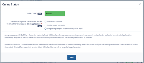
FreeFlags out members online status in all comments and reviews areas of any application!
Out-of-the-box support for the following IPS applications and areas:
Forum - Topics - Posts Calendar - Event - Comments and Reviews Downloads - Comments and Reviews Commerce - Product Reviews Gallery - Album - Comments Gallery - Image - Comments Clubs supported as the above items are merely passed on through to the club. Note: For badges, the comment/review/post three-dot dropdown menu is often gatekept by numerous permissions. The badge is inserted within this structure. Typically, if the member group of a viewer allows them to report or share these comments/reviews/posts the badge will appear for them. Otherwise not. This gatekeeping may vary from app to app. If online status is vitally important to your community use one of the other two options.
For all other 3rd-party applications, as long as they are using the built-in Invision Community commenting and reviews templates this will slot in seamlessly. Note this explicitly means they are using the LITERAL templates as provided in the Core application; called directly from the Core application (as they should). If they copy those templates and include them within their own application, or roll their own versions, in either case this mod is not likely to work with those items.
Open to additional indicators. Just ask in the support topic (though no promises).
By Scott4 -
With Invision Community 4.4 this plugin is mostly no longer needed! Go to the Admin Control Panel - Members - Profiles - Profile Settings Tab, scroll to the bottom of the page:
Set that to global and save. That will add group formatting to user links to 99% of what this plugin did years ago...
So what does this plugin do now?
This plugin just looks for the edge cases that new internal setting misses and tries to patch them up. Some are doable, others not. It now covers:
Profile page header and member hovercards.
Messenger conversation participants block.
The messenger sidebar area is more or less out of bounds for name formatting. Those names appearing there are not template-output but constructed via the underlying messenger methods and are inserted into language strings directly. It could be done but honestly its way way too messy and not worth anyone's time.
Forum posts member info sections.
{member='name'} Template Output Plugins
These are shortcuts in templates that allow the template author to kick out a single member variable. Version 19 of this plugin now has a setting that will allow you to format these specific instances universally. You'll likely notice it firstly in the usermenu at the top of your community where your logged in name appears. If this, or any other newly-formatted name showing up somewhere is not to your liking you'll need to leave this setting off as this is applied to every {member='name} instance and cannot be filtered or targeted to exclude apps or sections of applications specifically at this time.
Be sure to hit the plugin's settings in the ACP before using it!
By Scott3 -
Punch up those member hovercards!
Expansive backgrounds!
Yearbook Quote feature!
Let your members flash some personality and drive member engagement!
Profile Fields available for use on the hovercard!
This mod swaps out the usual member hovercard for a new template; one that emphasizes appearance and personality instead of just dumping profile information in a list which they can get by just visiting the member's profile anyways.
What's there?
Big full-sweep coverphoto (support for default as well), all the new badge stuff, registration, online status, and more.
Where's that image coming from?
That's the member's coverphoto! If they don't have one the Invision Community default profile background stuff is used.
Yearbook Quote Feature?
Although I debated sticking in a member's status update as the centered text, there are too many reasons not to, including not everyone is using status updates, often times those updates are throw-away notes about nothing, updated rarely, and so on. With a specific quote feature your members have the opportunity to flash some personality - be it describing themselves, Tinder-like blurbs, using a quote from a movie or video game, and so on.
Why not use the About Me feature from the profile?
That's a full editor field - images and lots of other things can go in there. This is meant to be simple and direct.
Can I change that name to something else instead of Yearbook Quote?
Yep! In settings. Hoverboard Quote, Hovercard Quote, Quote, Say Something, Tinder Blurb, whatever... Call it what you want!
Is this stuff also on the profile pages?
Yes - it's also where they add/edit it. Click the gear icon to have at it.
Can I use the Yearbook Quote feature but not the new fancy hovercards?
Sure. You can toggle on/off the use of the new hovercards in settings. To completely disable everything just toggle the plugin off in the ACP.
Profile Fields Too?
You bet! Select which ones to pass through to the template (admin-only and editor fields excluded at the moment). See the support topic for how to customize the display of these. Fields with short (length) text will work best here.
All the little content bits are in flex-boxes, including your profile field adds. Look at the screen shots to get an idea how they will flow in.
What are "Click Cards"?
You can actually disable the hover functionality of these member hovercards. When you do that, users will need to click the member avatar to trigger the display of the card. When the cards are set to hover-mode, they appear when the mouse cursor hovers over a member avatar and these will, since it is a mouse hover action, only appear to desktop users - tablet and phone users never see these cards. When you toggle the cards to click functionality that covers tapping and these will now display to tablet and phone users just fine. This is a usability decision to be made by you and you alone. If you ask for my opinion I'd consider how many of my visitors are tablet/phone based before enabling this feature. If you have more mobile than desktop, go for it! You can always turn this off later. Version 5 adds the ability to apply this functionality to the user names as well.
Moderation?
Of course. If a member has not entered a quote yet, the box will appear only that member and no one else (mods and admins included), with text telling that member to add a quote. Once a quote is entered, the quote will appear to everyone AND mods and admins will have to power to also edit those quotes. Mod permission is being able to edit profiles, if a mod has that, they can edit these. And yes, mod/admin actions on these items will appear in the Moderators Log in case you have some mods/admins deciding to mess with people instead of actually correctly moderating inappropriate content (whatever that is for your community...)
Anything for moderators?
Yep! Banned status, posting restrictions, and the like will display on the hover card to the member themselves if they are viewing their own, any moderator with the power to view reports, and all administrators.
Anything in the ACP?
Other than the plugin settings and entries in the Moderators Log, no, nothing in the ACP Member view or anything like that. All moderation takes place on a member's profile page in the Yearbook Quote block. If you have a member who continually abuses this quote feature by inputting stuff you don't want, the solution isn't adding more permissions to disable this feature on a member by member basis - the solution is to ban the member.
Anonymous Users?
Yes, accounted for. Anon users can browse with little worry of being "found out".
Customs Available?
Sure! Some communities may want some community-specific information to appear on the hovercard. Not a problem. Expect to pay a (nominal one time fee) if it is something that can benefit all users of this mod in which case you are sponsoring a new feature for everyone (and paying to get it done now instead waiting for me to get around to it) or a (one-time fee X 2) for a mod specific to your community only, provided it is doable.
By Scott7 -
Snowflakes
FreeSimple no-CPU-impact, full-page snowflakes, gently falling and swaying in the soft wind.
Light-blue-ish.
Install, and they are on for everyone, until you toggle the plugin off in the ACP or uninstall.
If you want all the configurations made available to you and maybe let users toggle it on/off on the front end, make with the hew and cry and I'll grab a beer and code it out but that one will cost you a few bucks (once).
Not mine, I'm just packaging it up for INVCOM 4x. MIT licensed: https://github.com/hcodes/snowflakes
By Scott9 -
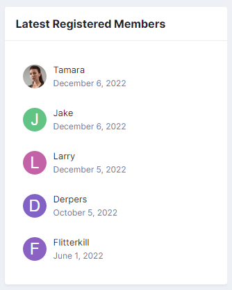
Adds a new widget block with the latest registered members on your board. You can display names with member avatars or just names only. Never displays validating members, only those fully registered and confirmed.
Configure the display settings by editing the widget after you place it on the page:
Format user links according to the group color Names-only display option Number of users to show Choose which user groups will be able to view the block.By Scott9 -
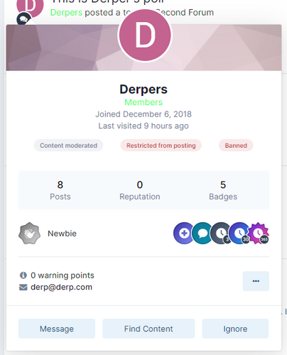
This plugin will show on a member's hovercard, for moderators who can view warnings, the restrictions applied to the member.
Will show the following restrictions:
if the member is banned if the member is restricted from posting if the member has their content moderated This will also display the time of each item of the above items if not set as permanent. Hovering over the badges will provide additional information via tooltip.
Not compatible with Awesome Member Hovercards but this functionality IS INCLUDED with Awesome Member Hovercards.
By Scott16 -
Group Name Indicator
FreeShow a legend of your groups in the Who's Online and Recently Browsing widgets, sorted in the order you specify and linked to the search system. Handy so that people know what those group prefixes and suffixes mean.
You choose which groups appear in the legend, and the order they will appear in, with the plugin settings in the ACP. Group links will carry any group formatting (colors, etc.) you may have set. Clicking the entries in the legend takes users to a list of all members with that group designation.
This version is probably fine with 4.6.x but it's been awhile so try it and disable it if it doesn't work.
By Scott40 -
Those of you doing serious custom work or jumping into other clients Pages installations to design, patch, change things in templates - especially heavily customized forms - probably want easy access to the database field id numbers. Database category IDs as well.
Here you go.
By Scott7 -
This plugin will display products from your Invision Community Commerce Store in a widget block using an image carousel.
You can choose to display either New Products or Featured Products and set the groups allowed to view the widget block.
Featured store items are set in the Commerce app and that is where this block will pull from. When you edit a product, go to the store settings tab. The toggle to feature the item on the store index page is the one you want.
New store items are a setting in Commerce that allows you to set the number of days back a product is considered "new" to the store and also the maximum number of items to falg as new. Whatever products fall under those settings will appear in the widget.
Most sites use the featured option as new items don't usually get added into the store on a daily, if not weekly, basis, so even if you set the lookback to 30 days for new, you run the risk of an empty widget.
Requires Invision Community Commerce obviously.
The carousel will not turn on unless you have more products than will fit inside the widget. It also will not magically turn on if you shrink your browser width. The carousel determines itself whether to enable or not when the page is first loaded.
Outside of that, that's pretty much it.
By Scott5
-
4x purchases will not carry over to 5x - everything needs to be re-written under the new 5x framework
